

Falling in Love with Illustration All Over Again
Finding joy in a new medium

For years now, I’ve worked almost exclusively with gouache and coloured pencils.
I love the combination — the textures I can get from layering the two are so satisfying. Some of my favourite illustrations have come from this duo. But over time, I started to feel stuck. Bored, even. It wasn’t that the mediums had lost their charm — it’s just that I hadn’t really explored anything else.


So, back in January, I set a goal for myself: make more time for play in my sketchbook.
The truth is, I’m a terrible sketchbooker — especially for someone who is tryign to work as a full-time illustrator. I found myself sketching on my iPad more often than not. Even though my final pieces are made with traditional materials, I would always start the process digitally. I’d sketch in Procreate, print it out, then use a lightbox to trace the image onto the paper I planned to paint on.
Why?
Because I was afraid of making mistakes. I didn’t want to see my errors staring back at me from the page. On the iPad, you can tap "undo" and pretend the slip-up never happened. That kind of control, while convenient, really started to mess with my confidence. I began associating mistakes with failure, and perfection with being a “real artist.”
It made the process stressful — rigid. I wasn’t giving myself space for play, for experimentation, for the discovery I was craving.
So, I made a shift.
In January, I told myself I’d spend more time in my physical sketchbook. No more undo buttons. I started using pens, markers, pastels — anything that would force me to face my mistakes head-on.
This whole sketchbook journey probably deserves its own newsletter, and maybe one day I’ll share more about it. But for now, I want to talk about one beautiful thing that’s come out of this practice:
I found a new medium I absolutely love.
For Christmas, my husband got me a set of PanPastels I had picked out. I’d been eyeing them for years, but the price always held me back. Since I couldn’t test them first, I kept putting it off. I chose the “Sketch Tones” set: Black, Raw Umber Shade, Payne's Gray, Red Iron Oxide Shade, Yellow Oxide Shade, Titanium White, Burnt Sienna. Not the most exciting colours, I know — but they felt like a solid base to build from if I ended up liking them.
And I did.
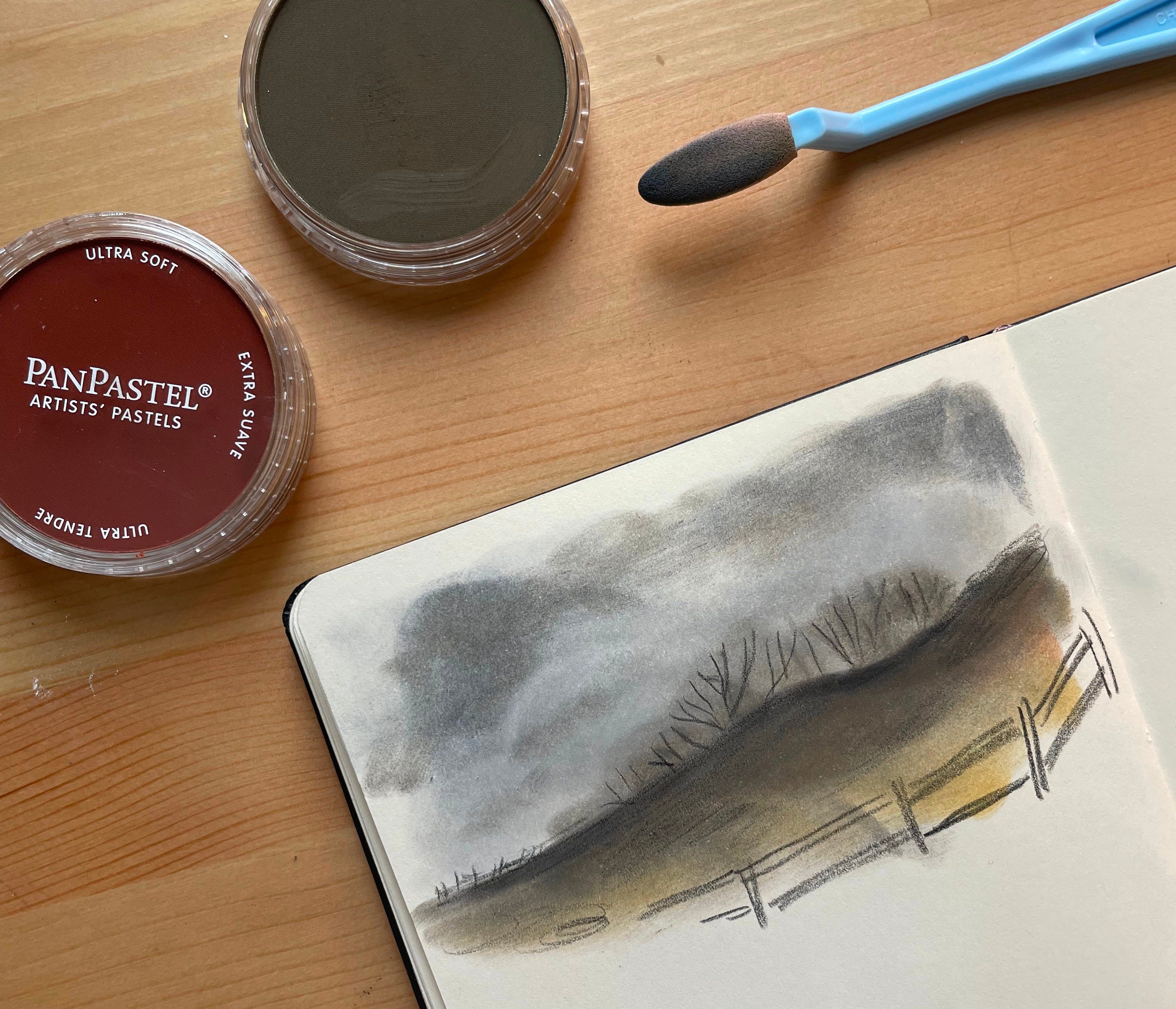
While I was in Japan, I picked up a colour called Permanent Green, and that’s when things really took off. I started using it over character sketches just to add a pop of colour. The soft, dusty texture was dreamy to work with.


As I gained confidence, I began planning illustrations with PanPastels in mind — thinking about how I could use the texture and palette intentionally.
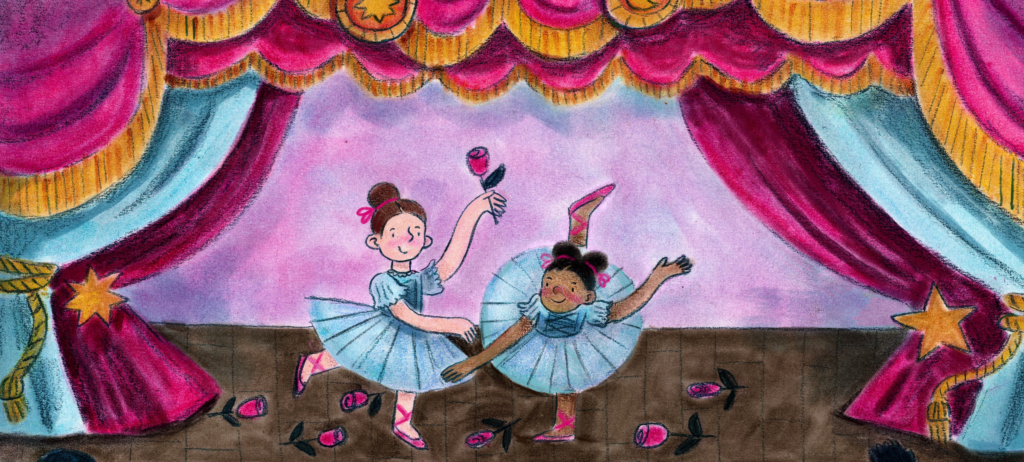
This illustration here was my first big piece using PanPastels. The setting was created entirely with them, and I finished off the characters with gouache and coloured pencil. It felt like the perfect way to introduce the new medium into my process without too much pressure.
I loved this piece.


It felt like a real step forward — a fresh start. Something about the pastels just clicked, and I found myself hungry to experiment more. I started looking up artists who use pastels regularly and picked up a couple more colours (Turquoise and Magenta). I even dug out my old Prismacolor soft pastels from college and started incorporating them into my illustrations.
A few Pastel Illustrators that I haven fallen in love with


Not everything turned out great. Some pieces were kind of a mess.
But that was the point.
It felt exciting. The mistakes were worth it — even valuable.
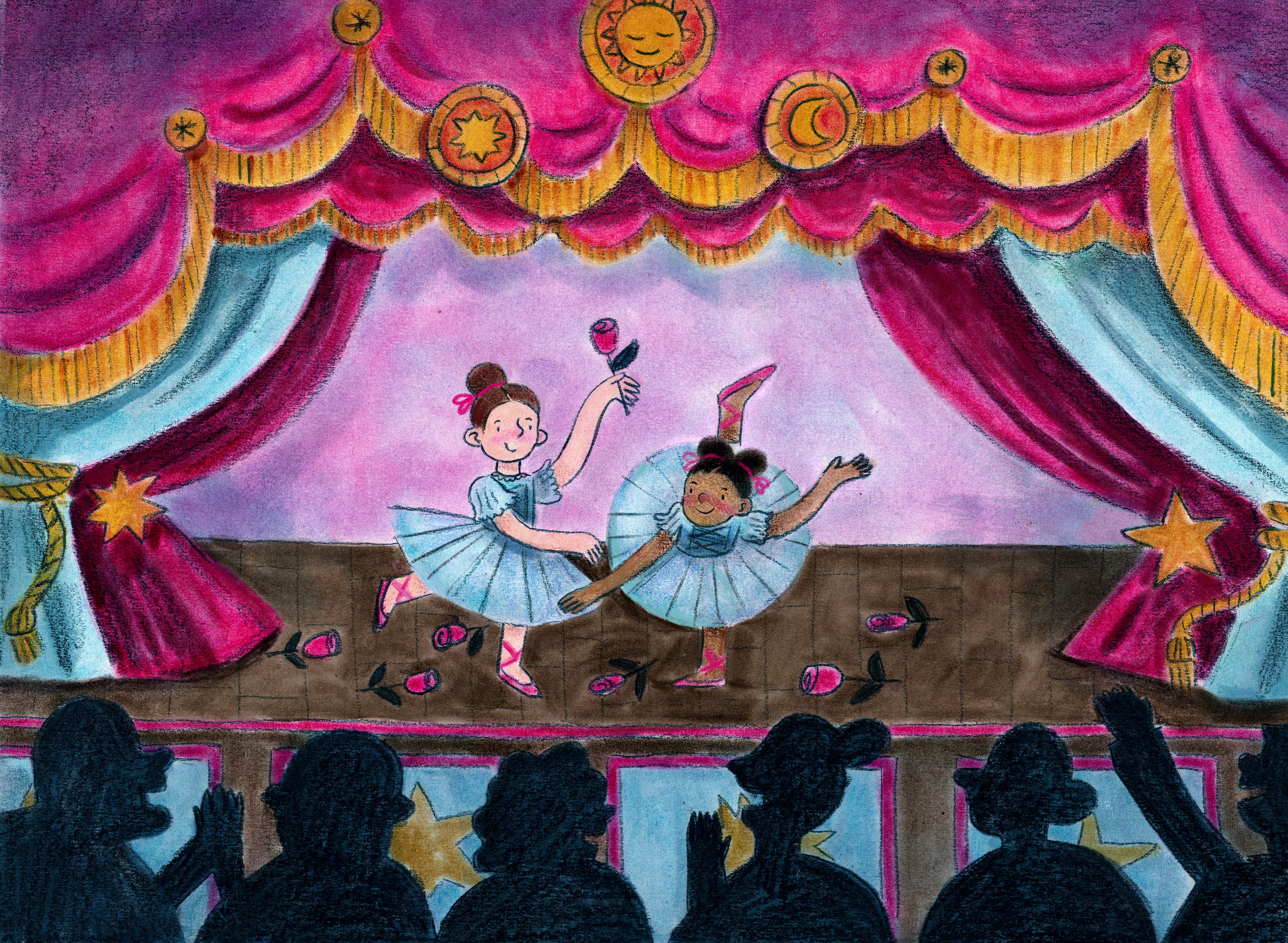
My most recent illustration is the one I’m most proud of.
Start to finish, it was done on paper. No digital sketch. No tracing. I let myself make mistakes. I messed up proportions and perspective and even started over more than once. I used a dark Ink Blue Derwent Drawing pencil — not exactly known for being easy to erase — and sketched my characters directly on the page. Then I mapped out a colour palette of just six shades and layered them to create gradients and depth.
After scanning it in, I added some darker shading digitally that I couldn’t achieve with the colours I had on hand.


I know this might not sound like a huge achievement to some, but for me, it’s huge.
It’s the first time in years I didn’t hide behind the safety of my iPad. And honestly, I wouldn’t have gotten here without the last few months of sketchbook play and experimentation. It’s helped rebuild my confidence — not just as an artist, but as someone who wants to keep growing.
If there’s a medium you’ve been curious about but hesitant to try, I really encourage you to give it a shot. You never know what might come out of it.
The Grand Reveal
Bits and Bobs
Thrifted books
A couple of weeks ago I found these two little gems at a Salvation Army.


Spring Flowers
Spring is finally in full bloom, and I couldn’t be happier.
Lately, my desk has been filled with an endless stream of fresh flowers — I just can’t get enough of them. My window has been open all week, letting in the soft breeze, the scent of the season, and the gentle sound of birdsong as I sit down to write this newsletter.

On the Same Page
My best friends Kat and Mads just bought a bookstore in Sydney, Cape Breton Island!
I’m so incredibly proud of them, and I can’t wait for their grand opening next month. Their shop is called On the Same Page, and it’s already shaping up to be such a cozy and thoughtful space.
Here’s a link to their Instagram — check them out and show them some love! 💕


And that’s that — another newsletter, wrapped, sealed, and delivered.
Cheers my Lovelies,
Leah Bee xx